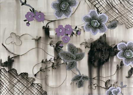
Dancing All Over Heaven – Mille Fiore ( A Thousand Flowers)
This series of drawings has been informed by research carried out in Venice in July 2023. The project is an enquiry of the Murano glass bead production and how it relates to colonial histories. My enquiry led me down numerous paths, chasing stories that would shine a light on past lives.
A variety of beads were manufactured such as Mille Fiore, Conte and Perler. The trade in beads brought Venice great wealth and prosperity.
In the eighteenth century the production of beads changed, due to the large quantity of loose beads been lost during crossings. The employment of women was a game changer in the transportation of these objects. The beads would be strung by women for ease of transportation to European ports.
Mille Fiore would be amongst other cargo used for trade, these were shipped to European ports and from there onto slave ships bound for the West Coast of Africa. From here beads were traded for human cargo.
Africans captured and stolen from different tribes were enslaved and transported to the Americas and to the West Indies, their journey known as the Middle Passage. If captives survived this journey, they would arrive to the New World stripped of name, Gods, language, identity and village, no be-longing. Vanished and rendered invisible. The longing continued for 400 years.
During my research I found documentation of two slave ships that left Liverpool bound for Jamaica. The Tamerlane in 1769 and the Tamar in 1801. My paternal grandmother was named Tamar. It makes me reflect on the possibility that my ancestors were voyagers on these vessels. These fragments are part of my story. I am still searching, collecting things together in order to make sense of the whole.
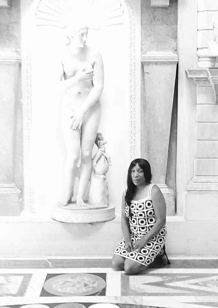
Research – The Colour of Absence / Exploratory Drawings
The beginnings of the exploratory drawings now realised as “The Colour of Absence” were sparked by my time spent in Venice. My initial ideas came out of the knowledge of the historical development of the Venice Biennale and the Giardini in the 19th century. What was significant at this time in particular was the popular practice of presenting people as exhibits, this was considered acceptable. In this process the body is objectified and dehumanised. The purpose of these human exhibitions was for spectacle and display of the ‘Other’, of difference. A ‘them’ and us mentality which fuelled the prevailing mindset. These human tableau were created for the curiosity and consumption of the Western gaze. The spectator is seen as a signifier of taste, class and wealth. Such practice plays with economies of visibility and disappearance.
Once back in the UK I came across information about 19th century miniature eye portraits. They were very fashionable at the time as the eye was considered to be the window of the soul. My enquiry raised questions that circulate around concepts of been present yet at the same time not been visible and trying to excavate stories that have been deliberately hidden.
The Colour of Absence is a reflection of historical and contemporary issues that relate to the black body and feminine perspectives. It is an investigation of ways of looking and perception. It places the roles of spectator and spectacle under the microscope.
We are bombarded by images all the time whilst at the same time there exists ‘space’ where things are able to remain faceless.
Going forward, in relation to issues that connect to social media and AI, how are we able to unravel the stories where there is fabrication and concealment of reality. What is our reality and how does this further distort our sense of identity and visibility.


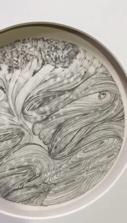
Storm In A Teacup
The phrase “Storm In A Teacup” enlights a train of thought from the idea of a small teacup being overwhelmed by a tempest, or violent storm. It is used to describe a situation where a small issue is blown out of proportion, causing excessive drama or concern. The phrase is often used to emphasise that a situation is not as serious as it may seem.
In many cases this attitude can minimise the trauma caused by violence, whether in the domestic domain or globally.
The starting point of this series of work is in response to the phrase “Storm In A Teacup” which I often overheard as a child and how experience is attached to objects. In my case the decorative ceramic collections that remain in my memory. Seen as sentinels, their presence maintained a distance of quiet resistance and politeness – Of bon vivir and all is well. They were the public face of private matters, set within a domestic sphere that was fragile and easily broken. It is much about the destruction of another’s patterns and rhythm of life and their beliefs of beauty.
We can consider another perspective of “Storm in a Teacup” as feminine, outwardly harmless and innocent. Yet inside she is strong and unbound.
Pictorial elements look to the natural environment as source material. Where climate change and questions around mental health have filtered through. Drawings are inspired by personal and historical narratives and contemporary subjects. Research trips to Southern Ireland along with references to sky and sea studies of JMW Turner, the writings of Bell Hooks and the poetry of Emily Dickinson have informed this recent body of work.
FLOATING WORLD
A collection of work on paper of Japanese Sumi-e Ink and Collage informed by historical archives of Japanese kimono patterns and Ukiyo-e woodblock prints of the 17th century. Personal narratives are explored across the work taking inspiration from my mothers Japanese jewellery box of black laquer. Depicting floating mountains, clouds, birds, trees and sail boats and embellished with mother of pearl and abalone shell. Inside is lined with a fuschia pink velvet base and a panorama of faceted mirrors in the lid.
We moved around quite a bit when I was younger. Objects were my anchor as a child and were my dream spaces. They opened up whole new worlds to paint and draw.